Climate change impact tracker
August 2020
Lorem ipsum dolor sit amet, consectetur adipisicing elit. Fugiat expedita deleniti ducimus totam! Sint facilis eos quas in aperiam suscipit eum enim! Ad doloremque odio iusto perferendis accusantium hic dicta!
Forest vitality index
July 2020
Lorem ipsum dolor sit amet consectetur adipisicing elit. Harum maxime eveniet esse perferendis labore, odio autem voluptatem! Repudiandae nostrum quia itaque, beatae possimus qui assumenda, ipsa voluptatum molestiae, recusandae aliquam?
Digital contact tracing
April 2020
Lorem ipsum dolor sit amet consectetur adipisicing elit. Omnis nam ipsa non iusto assumenda aliquam eligendi necessitatibus ratione quaerat repudiandae voluptate, vero quas quae dolores reiciendis doloremque repellendus aperiam blanditiis.
Mapping non-profit housing
February 2020
 Lorem ipsum dolor sit amet consectetur adipisicing elit. Quas sunt laudantium voluptatum distinctio ducimus? Deserunt, possimus veritatis ratione qui dolorem hic corrupti? Alias consequatur maxime obcaecati est sed dolorem dignissimos.
CO2 emissions calculator
January 2020
Lorem ipsum dolor sit amet, consectetur adipisicing elit. Totam autem at minus dolore, esse impedit doloribus unde placeat aliquid animi sunt alias quisquam veritatis incidunt. Illum, error necessitatibus. Necessitatibus, adipisci.
Which party are you?
September 2019
In the run-up to the Swiss general election of October 20th I created an interactive tool to match voting behaviour to political parties. The user reviews the propositions that were decided upon during the preceding election period by scrolling through cards containing a summary of each issue and brief arguments in favour and against voting yes. To find the best match, the votes cast during the game are compared with the voting recommendations given out by the political parties at the time.
Dossier
2019
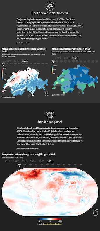
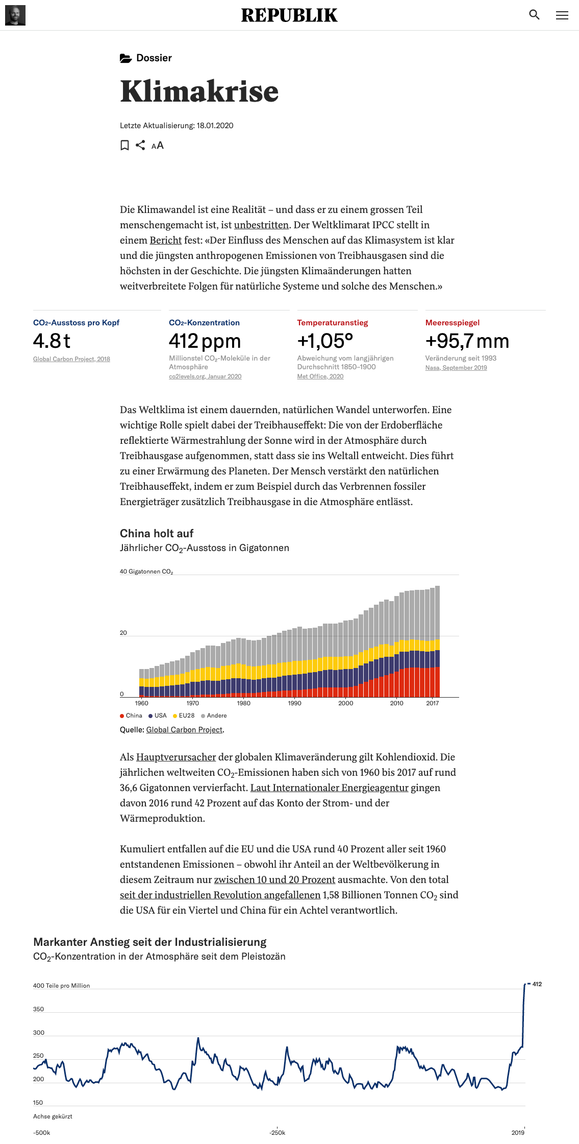
With the aim of providing readers with concise overviews of the important issues of the day—while also resurfacing the most relevant pieces of existing content—I introduced the “dossier” format at Republik. A dossier consists of a single, continually-updated page containing key metrics, crucial facts and links to selected Republik articles about an issue. The purpose of the dossier format is to give important topics a permanent home within the publication and to offer summaries that are both informative and visually appealing. The list of dossiers is growing steadily. During my time at Republik I was the author and maintainer of two of them: Climate Crisis and Swiss General Election of 2019.
Future cities
July 2019
As a companion visualization to Simon Schmid’s article covering a 2019 ETH study of how the changing climate is affecting cities globally, I created a scrollytelling interactive story that lets the user hone his intuition for the coming change. The researchers compared metrics such as “warmest month of the year” or “average annual rainfall” across 520 large cities and matched current values to climate model projections for the year 2050. The user scrolls through a map showing how far a city will “travel” to reach the city that today best matches its future profile (e.g. the Miami of 2050 and the Havana of today, 367km to its south-west). The journey is accompanied by short explanatory notes and charts quantifying the change.
Game of life
May 2019
What is it like to be on social welfare? In the run-up to a referendum in the canton of Bern demanding a drastic reduction of the personal allowance for welfare recipients Elia Blülle and I created a simulation that approximates the budgetary constraints of living on CHF977 per month. By travelling over the fields of a Monopoly-like board the user has to manage his expenses and must balance daily necessities with small luxuries while preparing for unexpected emergencies.
Swiss e-voting
March 2019
When Swiss Post emerged as the only remaining supplier of electronic voting software necessary to implement the national government’s decision to introduce voting over the internet, Republik covered the ensuing public debate thoroughly. I contributed articles about the flawed publication of the source code, the scathing reviews by security researchers and the spotty certification process.
Skiing and climate change
February 2019
The climate crisis may be global—but its impact will be felt locally. In the wake of the publication of the CH2018 Climate Scenarios report, Simon Schmid and I created an interactive data visualization to improve the user’s understanding of the long-term repercussions of the looming crisis. The tool shows how the snow conditions in major ski resorts will change according to projections by researchers at the Swiss Institute for Snow and Avalanche Research. It plots the altitudes of the ski lifts in a given resort colored by the reliability of snow coverage at both the valley and mountain station. The user can select a year between 2005 and 2085 to see how the area’s prospects are likely to change.